
Hi, I wanted to redraw the assets because for me the svg files should be in the source code. I want reviews on my assets and that is why I am introducing this asset. What do you think about this asset?
https://github.com/Bob-Vador/unvanquish ... igsize.png
Over-detailed icons?
-
Gireen
- Graphic Designer
- Posts: 308
- Joined: Wed Mar 07, 2012 1:26 pm UTC
- Clan: [DoH]
- Location: Germany
- Contact:
Re: Over-detailed icons?
I split the post and moved it here that its public and more visible. Old topic is viewtopic.php?f=36&t=1744
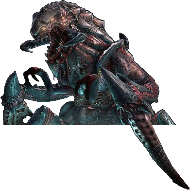
I think the many details on the Battlesuit could make it problematic as a icon.
As the original topic said they become harder to identify or wont look good if when they are smaller.
Also all icons should be only white without outlines so that they can be easy colored in.
I think the many details on the Battlesuit could make it problematic as a icon.
As the original topic said they become harder to identify or wont look good if when they are smaller.
Also all icons should be only white without outlines so that they can be easy colored in.
fear ma engrish ![]()
Re: Over-detailed icons?
I agreed the icon is over detailled but not the thing that request the icon needs to be only white, because I add the svg file for each png, because the goal is "icons can be modify easily"
-
Gireen
- Graphic Designer
- Posts: 308
- Joined: Wed Mar 07, 2012 1:26 pm UTC
- Clan: [DoH]
- Location: Germany
- Contact:
Re: Over-detailed icons?
That's what you say all the time but didn't show any real problem.freem wrote:OTOH there is currently a real visibility problem of icons, and an outline does improve on that.
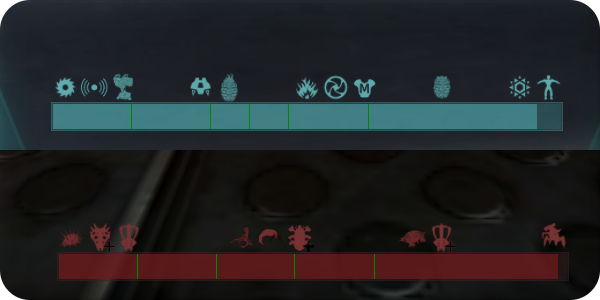
The stamina and health icons are perfectly visible even if stamina becomes harder to see if you point the icon exactly at a lamp.
The icons on the momentum bar are hard to see, especially the detailed ones but this could be solved with adding a semi transparent black background to these icons ingame and not the icon assets.
It becomes unnecessary complicated to change. Best example is try to change the icon color to something dark like black. It will turn into a blob so we would require extra versions for every icon if they had "hardcoded" outlines.Bob_Vador wrote:If the problem is about coloring them, then, as long as the svg files are around, that should be pretty easy to do?
An outline should be added, if at all, in the game itself where it would necessary and not in the graphics.
To be clear i think it is a good idea to vectorize all icons, cause i would like to have them turned into an icon font.
But adding black outline to all images makes future changes harder not easier and creates unnecessary work.
fear ma engrish ![]()
-
Gireen
- Graphic Designer
- Posts: 308
- Joined: Wed Mar 07, 2012 1:26 pm UTC
- Clan: [DoH]
- Location: Germany
- Contact:
Re: Over-detailed icons?
(-_-)freem wrote: I never talked about the health icon, which is, indeed, always easy to see.
Thats what i am saying, you complain that there is a problems with icons and want to have outlines on all of them.freem wrote:OTOH there is currently a real visibility problem of icons, and an outline does improve on that.
But you don't mention the concrete problems.
That's totally wrong. Maybe its hard for you to understand but i already told you this icon is important especially for new players to easily understand the meaning of the stamina bar.freem wrote:The stamina icon is currently useless, since it carries no info with it
And i also told you that it is not a problem with the stamina icon. You don't need to have it 100% visible at all times for it to fulfill its purpose.freem wrote:but at least you got the point that in bright areas, icons are hard to see.
Maybe you see the logical flaw in adding an outline to every icon, cause 2 are not good visible in one place.freem wrote: the most problematic ones, are the medkit and grenade icons
The problems of the inventory go beyond the icon visibility to a more conceptional level.
freem wrote:So you admit some useful icons can be hard to see, finally.
I think it is agreed by everyone that the icons in the inventory and momentum have no good visibility.
What i am saying is that that adding black lines to the icons is a generally bad idea and there are better solutions for the visibility problem.
Then i don't see a reason why we even need to have this discussion.freem wrote:Yes, to have a semi-transparent background behind the icons would also be a solution.
fear ma engrish ![]()
Re: Over-detailed icons?
+1 for doing this in game code. Even an offset shadow could be sufficient (= same icon colored with black and put under at an offset).Gireen wrote: The icons on the momentum bar are hard to see, especially the detailed ones but this could be solved with adding a semi transparent black background to these icons ingame and not the icon assets.